
“Good design is as little design as possible.” – Dieter Rams
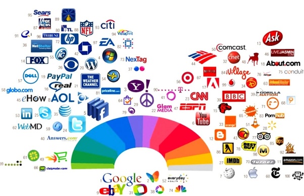
When you look first at the most popular and successful companies logos, initially you can think that they are very different and don’t have anything in common. But they DO!!! They do share some common graphic design elements! There are many lists of the most successful logos, and after looking over 50 logos we did build up for you a list of these characteristics:
Font
Font of the logo can affect the mood of the text. Different font families can bring specific characteristics. For example:
- Geometric – objective, clear
- Humanist – modern, empathetic
- Transitional – dynamic, strong
The most used Font styles in these logos were:
- Sans-Serif
- Serif
- Script
- Calligraphic
Color
The color palette used in logo can stimulate specific feelings. For example:
- Red – passion, aggression
- Blue – comfort, trust
The most used colors in the most successful logos are:
- Blue
- Red
- Multicolor
- Black
- Gray
- White
- Green
- Orange
- Brown
If we think about number of the colors used in most successful logos:
- 2-colors
- 1-color
- 3-colors
- 5-colors
- 6-colors
Shape / Dimension
When it comes to the most successful logos shape or dimensions, there are dominant shapes like:
- Rectangular
- Square
- Round
What about design? There are some also some trends:
- Flat
- Mxed
- Beveled
Name
Does the logo include full name or some initials:
- Yes – the majority of successful logos contain full business name
How many versions of logos do the most successful companies have:
- The majority have multiple versions of logo
Summary
Design trends tend to continuously change. But there are some physiologic aspect of human brain, or how our brain perceive the information. That is why you can use some simple but effective steps to make your business logo memorable:
- Blue is the most used color, followed by red
- San-Serif and upper case are the most useable font styles
- Rectangular is the most used shape
- Flat design is the most appealing, and less distracting on mobile devices
A logo is a company’s visual identity simplified into an icon. While a logo is not the most important part of branding, you know that your logo is doing well when it’s recognizable.