WeAreSnag Tile Installation Experts
Brand Design & Development Case Study
WeAreSnag transcends the conventional definition of a tile installation company, bearing a reputation intertwined with expertise, dependability, and precision. They collaborate with renowned interior designers and have their exceptional craftsmanship showcased in esteemed magazines such as “Real Simple.” Their high-quality work graces the residences of individuals like Emily Henderson, a multifaceted stylist, interior designer, television host, and the creative force behind Emily Henderson Design.
The logo we created for WeAreSnag aimed to convey a sense of strength and security. It’s a symbol of a company that delivers on its promises, one that leaves no room for doubt. The clean lines and balanced design are emblematic of the exact measurement and prototyping precision that WeAreSnag is known for.
The Logo Concept:
Our approach to crafting WeAreSnag’s logo was to capture the essence of trust, solidity, and cutting-edge expertise. The logo we envisioned had to be plain yet modern, an embodiment of minimalism, and it needed to grab attention. But more importantly, it needed to invoke a feeling of assurance and confidence.
The Design:
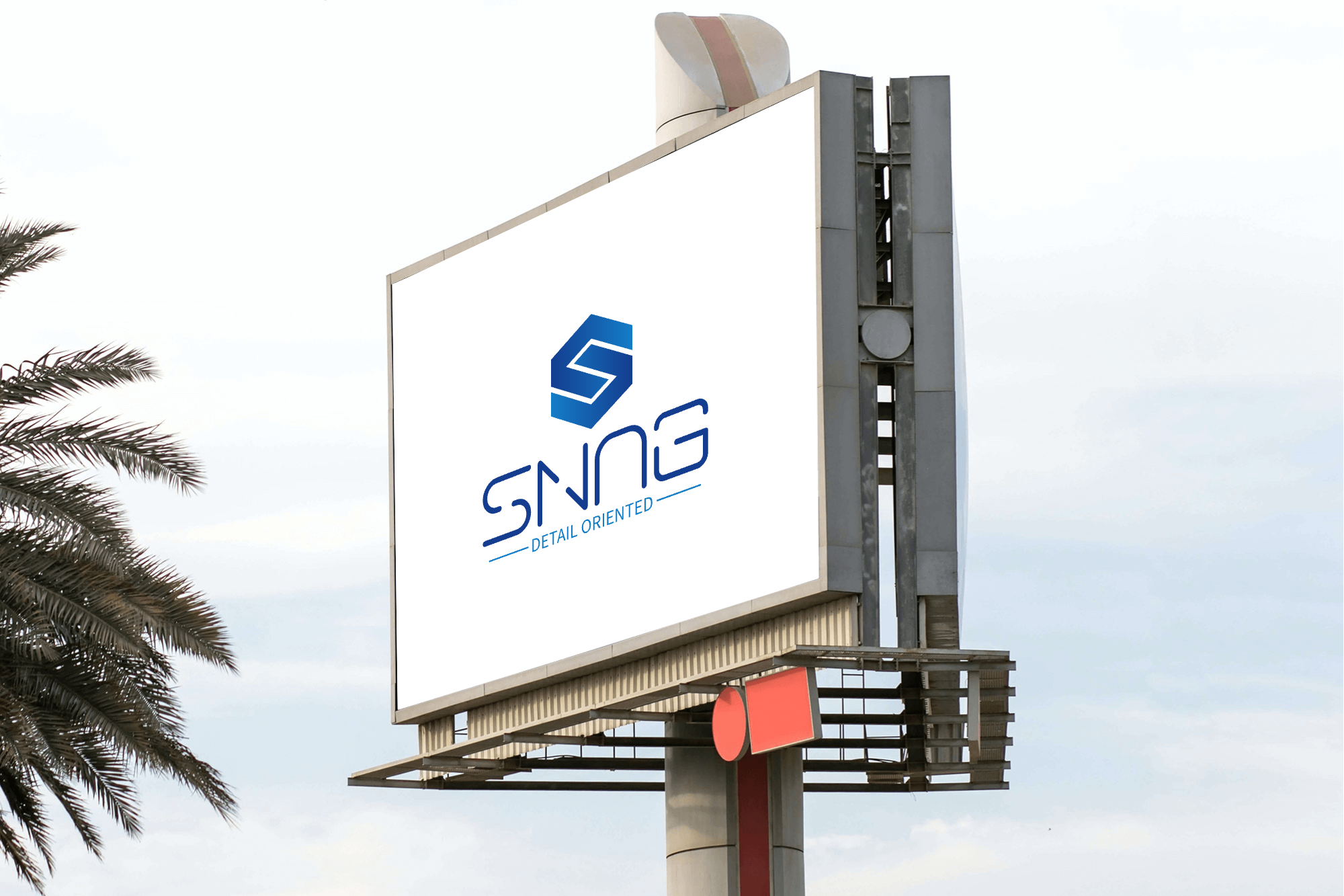
We opted for a sleek, clean design, featuring the company’s name in bold, uppercase letters. The “Detail Oriented” part was treated in a contemporary, sans-serif font, signifying the modern approach WeAreSnag brings to its work. “Snag” was rendered in a slightly more modern style font, symbolizing the timeless quality and integrity, and innovative approach that WeAreSnag stands for.
The color palette was kept simple, with a combination of deep navy blue and light blue. The gradient of navy blue radiates professionalism and trust, seamlessly transitioning within its shades, creating a sense of depth and reliability.
