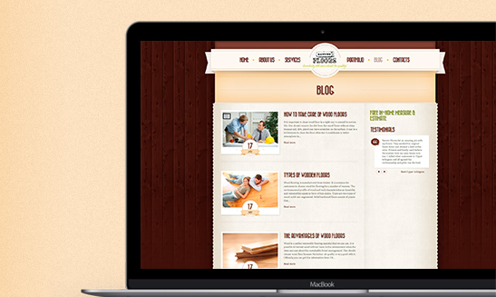
Naturefloors

Naturefloors

Naturefloors

Website Design & Development Case Study

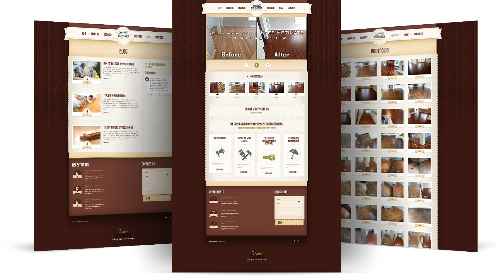
Naturefloors – the main activity of the company, the restoration of wooden floors, as well as offering installation services for new ones.

Client requirements and site task:
The client contacted us without the slightest idea of ​​what he needed. The only thing he said was “I want to be found on the Internet.”

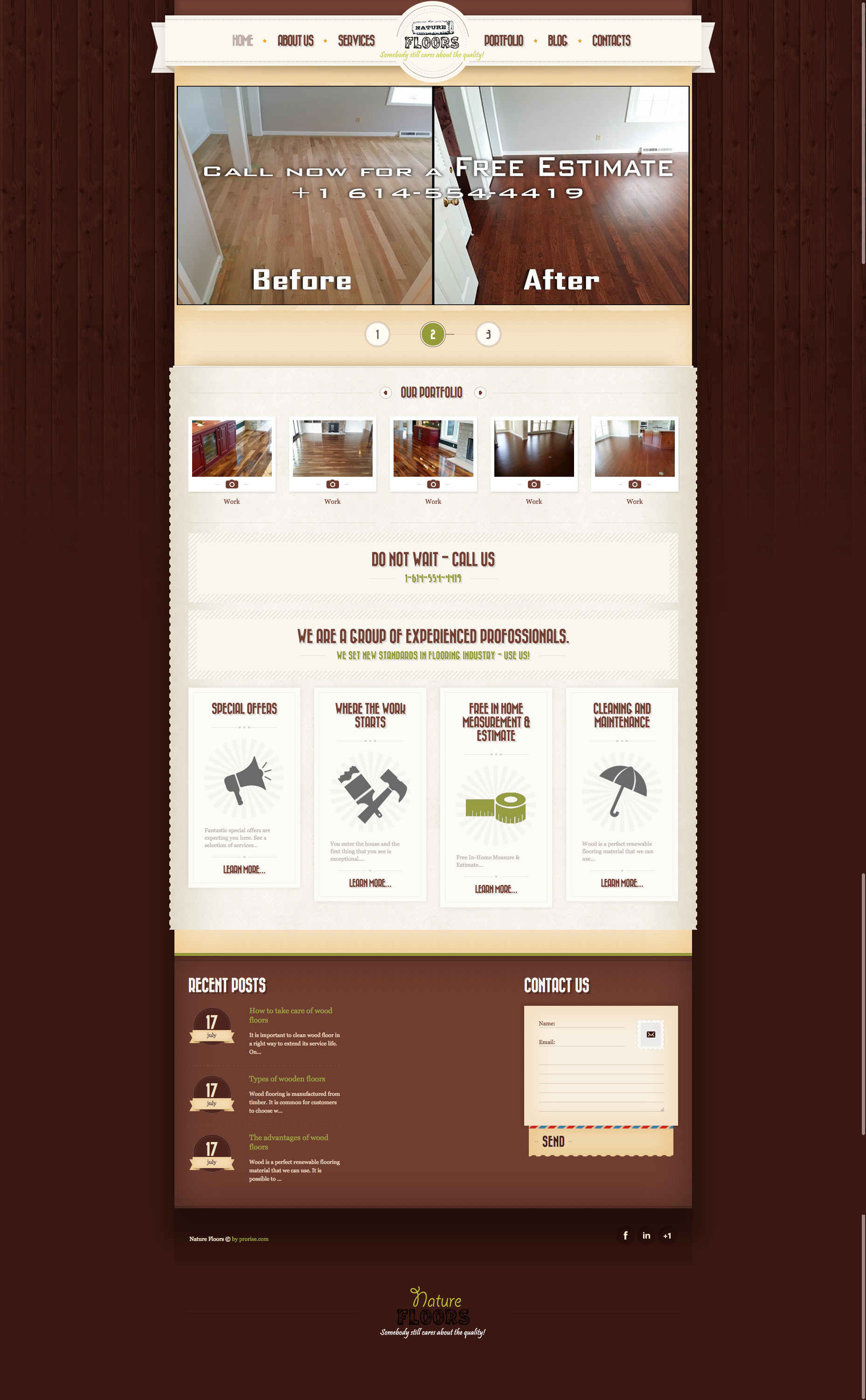
Having analyzed the market, we came to the conclusion that its main potential client is middle-aged and elderly people, and it is also possible with a taste of retro style.

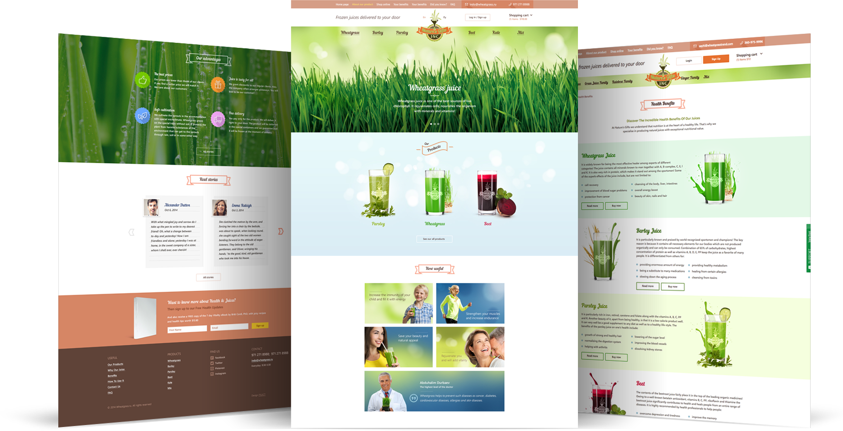
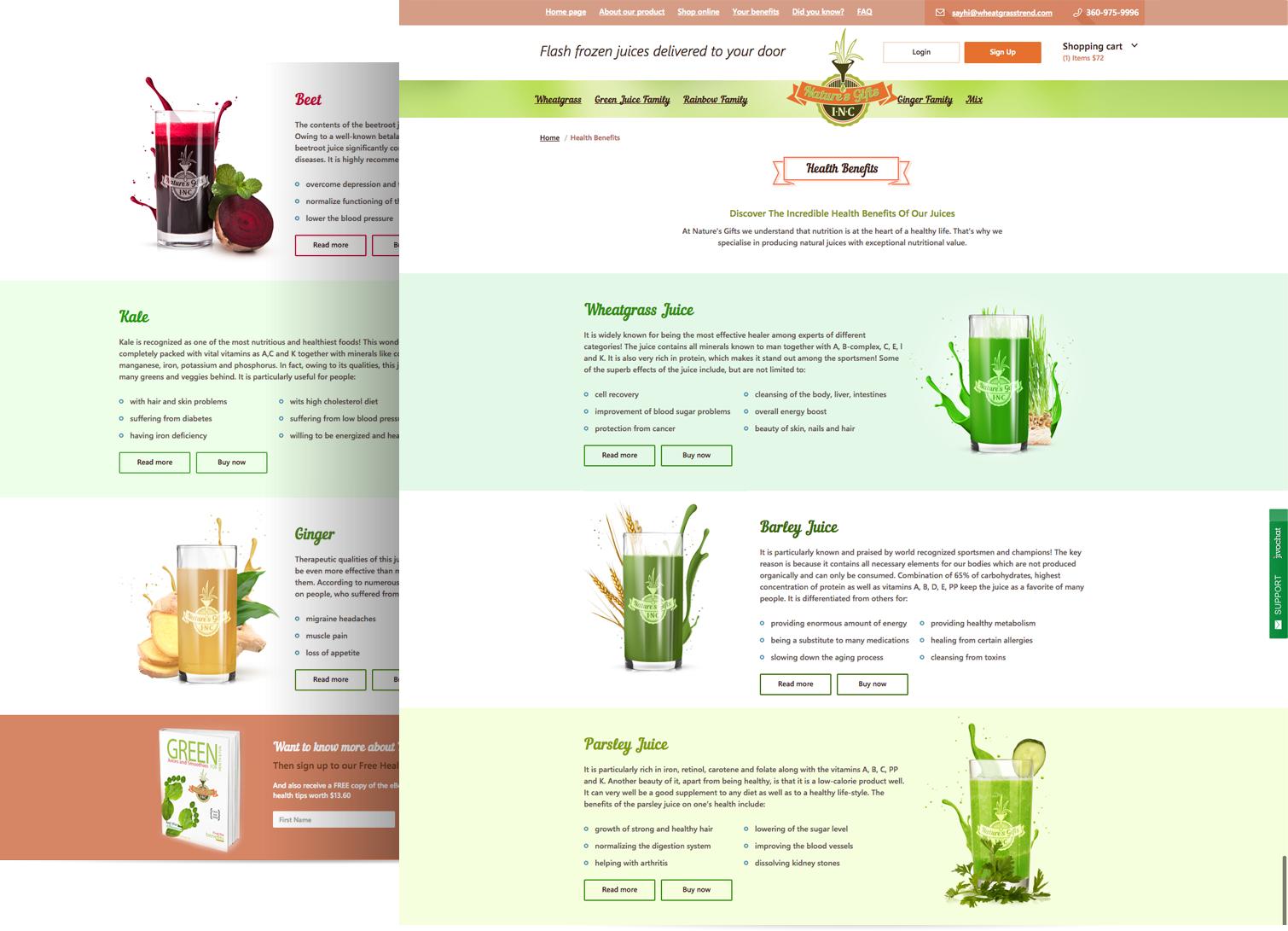
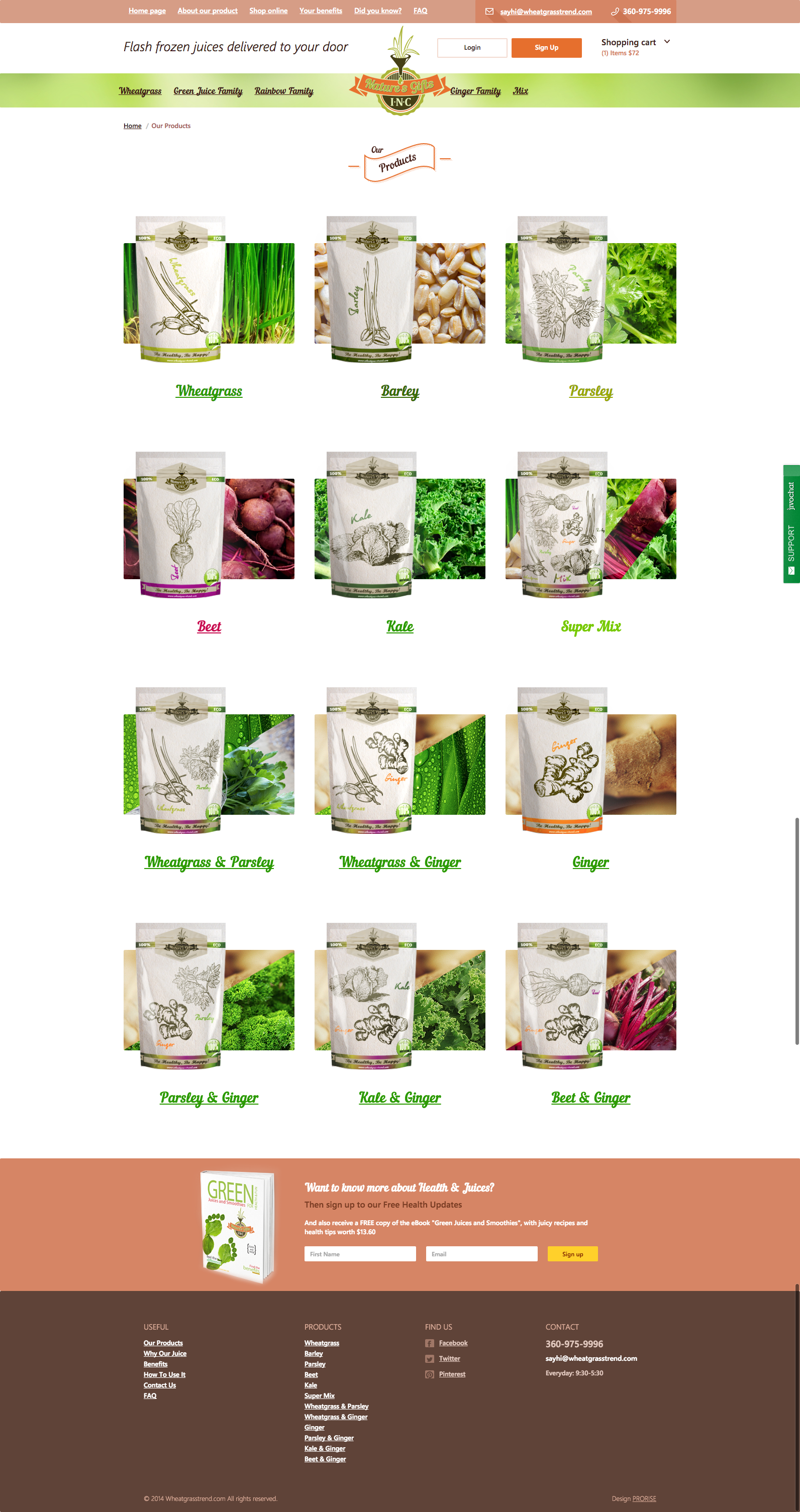
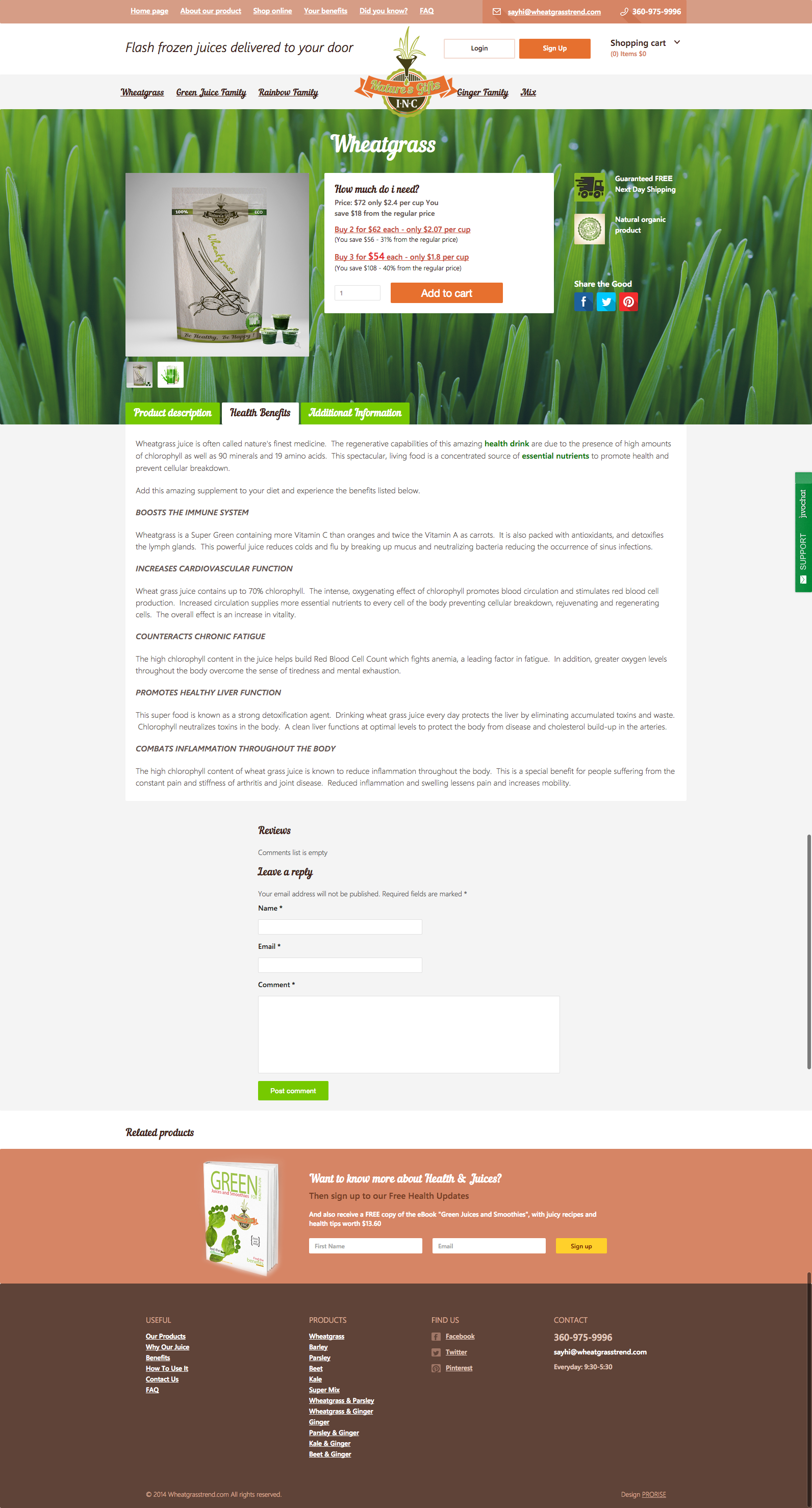
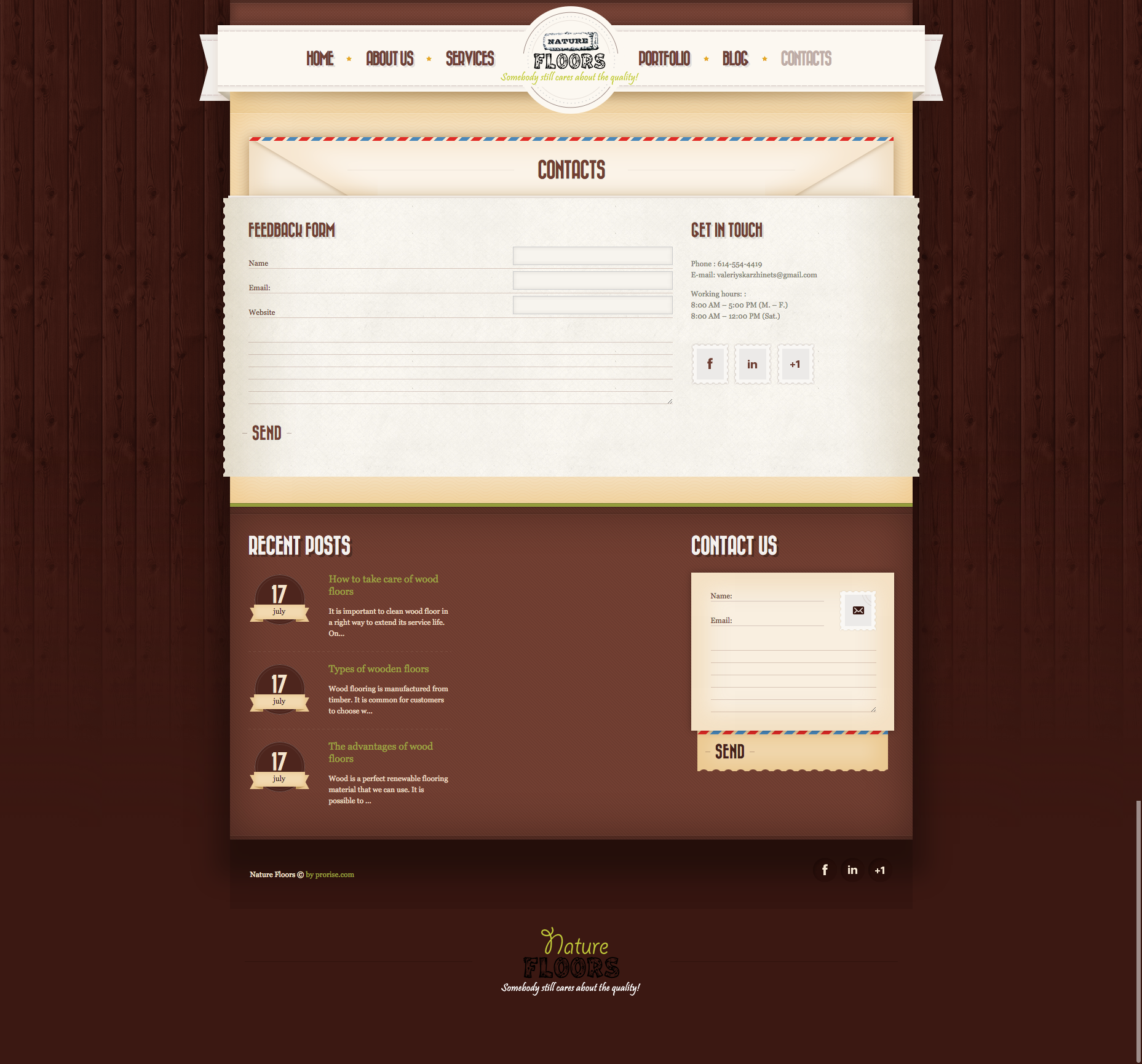
We decided to do the design in retro style. Customer approved our offer.

Developed website structure, design and logo.

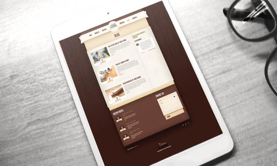
That’s what happened!

Pictures at the discretion of the designer.

The result not just satisfied the client, but also brought him new clients right in the first day after lunch.

Style & Imagery

\
#b8b8b8
\
#959c42
\
#ece8db
\
#5f4035
\
#efd4a8

We're Here!

We are Always Open for a Good cup of Coffee!

6DMS

6DMS

6 Degrees Manufacturing Solutions, Inc

Brand Design & Development Case Study

In the world of exact measurement and prototyping, 6DMS stands as a beacon of expertise. With extensive experience and a prestigious clientele that includes OEM NASA Boeing, PCC, and Lockheed Martin, 6DMS embodies high qualification, reliability, accuracy, and integrity. Our mission was to craft a logo that not only reflects these qualities but also instills a deep sense of trust and solidity, using a color palette of orange and silver.

The unique challenge of this project lay in the client’s specific request, which extended beyond aesthetics and delved into the realm of emotions. Rather than merely focusing on appearance, we needed to encapsulate the feelings this logo should evoke.

The Logo Concept:

Our logo design for 6DMS was conceived with a clear objective – to embody precision, trust, and excellence. It had to be plain, modern, and immediately eye-catching, all while creating a profound emotional connection.

The Design:

We opted for a simple yet striking design. The “6D” was rendered in bold, modern font, exuding a sense of contemporary sophistication. These characters represented the technical and precise aspect of the company’s work. The use of a vibrant orange color signified enthusiasm, energy, and innovation, while the silver added a touch of elegance and sophistication.

The Emotion:

The 6DMS logo design was intended to invoke feelings of assurance and confidence. It symbolized a company where clients could place absolute trust in the exact measurement and prototyping services provided. The bold orange color represented the dynamic approach and unwavering commitment to innovation, while the silver signified the depth of precision and reliability.

Ultimately, the 6DMS logo design, with its orange and silver color palette, is more than just an emblem; it’s a representation of the core values and the profound emotions that the company elicits. It serves as a visual embodiment of the trust, solidity, and excellence that 6DMS brings to its clients in the realm of prototyping and exact measurement.

We're Here!

We are Always Open for a Good cup of Coffee!

Wheatgrass

Wheatgrass

Wheatgrass

Website Design & Development Case Study

Wheatgrasstrend – the company which produces healthy frozen juices such as, wheat grass juice, barley juice, ginger juice and many others. 

This company came on American market just in 2014 and contacted us just in the beginning of their existence. The first task for us was to create their corporate identity.

It included all graphic elements which will represent the company: logo, business card, packing for each type of juice, delivery package, decoration of delivery cars, flyers etc.

The next task was to create a web-site. The client required an informative, user-friendly, bright and attractive web-site for their customers. The client took an active part in the development process of the web-site structure. All menu items and most of the functions were proposed by the owner. All we had to do was to execute well the customer requirements. When it comes to the design – we had to work and come with all graphics of the project. Every detail of the website was drawn individually and unique.

We have also developed a individual control panel for this online store, which included, storage functionality, product accounting and order processing. All of these features allowed adding and sorting the products, controlling its quantity on the warehouses which solved the supplying control and helped to react in time on new orders and processing it with efficiency, managing the discounts and bonus system. All of those are very important factors for any e-commerce project. Beside those futures we have connected the payment system which supported all popular payment ways and provided a safe payment in just two steps.

Style & Imagery

\
#d58565
\
#abb24a
\
#EDE9D0
\
#5f4035
\
#BDA79E

We're Here!

We are Always Open for a Good cup of Coffee!